by Joanne
and Emmett Eldred
(click on photos to enlarge image)
COLLECTING SILVER TEAPOTS AND STANDS
OUR COLLECTING GUIDELINES (1)
The following is the first in a series of papers, which
discuss several of the criteria we use in evaluating pieces we
collect. These discussions will highlight our approach when
considering form, originality of teapot and stand combinations,
engraving, hallmarks, condition, and crests & coats-of-arms. In
most cases we have used pictures from our modest but growing
collection to illustrate what is being described.
As is the case with collecting almost anything, the initial
learning curve can be quite steep. Being fairly new to the
subject it certainly applied to us. Our initial screen involved
only two basic areas; form and hallmarks. Our assessment of form
was subjective and based solely on our personal tastes at the
time. Of course having seen only a few examples we did not have
a broad reference base and therefore were unaware of the variety
of designs produced during the later part of the 18th century.
Our second screen was centered on hallmarks. As noted earlier,
one advantage in collecting English silver is its hallmarking
system. Fortunately we were able to locate several excellent
Websites for researching hallmarks, especially maker's marks.
Looking back on things we were very lucky with the majority of
our early purchases. We could have made some costly mistakes
because we did not realize that several other key factors, such
as crispness of the engraving, absence of repairs, surface
patina, presence of an identifiable coat-of-arms or crest, etc.,
significantly contributed to the desirability and therefore the
value of a set.
Over time we became more knowledgeable and ultimately developed
a pretty rigorous set of criteria for evaluating pieces we were
interested in purchasing. Our approach currently involves a
number of assessments (form, originality, engraving, hallmarks,
condition, crest), which we will describe over a series of
articles.
Part 1: FORM
How aesthetically pleasing is the overall teapot and stand
design? For us this determination still remains fairly
subjective but now it is based on having studied pictures of
hundreds of examples. Questions we typically ask ourselves focus
on such things as: how appealing is the overall design and
proportions of the teapot body; does the shape and stance of the
stand effectively balance the mass of the teapot; how well are
the handle and finial integrated into the overall design; how
carefully planned is any engraving and does it add or distract
from the overall statement. We also have some quirky criteria
related to form. For instance we have a strong preference for
teapots with straight spouts and only rarely consider purchasing
ones with shaped spouts. We also like teapots with an engraved
crest or coat-of-arms, and believe the addition of a crest/arms
within a cartouche helps complete the overall design and adds to
the charm of a teapot and stand. Also, we are now at a point in
our collecting where variety is becoming more of a consideration.
We picked three examples to try to illustrate some of the above
points.
The first is a teapot and stand by Peter and Ann Bateman. It is
difficult to garner from the picture but the teapot is quite
substantial in size, its body measuring 5 ¾ inches across. This
created a design challenge for the artists since they needed to
somehow downplay the breadth of the teapot body. They
accomplished this in several ways. They incorporated an inverted
arch to define the top of the teapot and then added a somewhat
exaggerated dome for the lid. They also added a broad band of
engraving to the top of the teapot body giving the illusion that
the main body was the area without engraving, and this
impression was reinforced by centering the cartouche in the
middle of this field. To further emphasize the vertical they
capped the piece with a perfectly-proportioned, carved pineapple
finial. In combination, these design elements were quite
effective in downplaying the horizontal and emphasizing the
vertical.
To maintain horizontal symmetry and balance, the artists chose
to closely equate the height and relative protrusion of the
handle and spout. Since both the handle and spout radiate upward,
they provide what might be termed "upward lift" to the piece.
Elevating the teapot on an oval stand supported by four
delicately scrolled feet adds a sense of lightness while at the
same time providing a bit of stature to the overall statement.
Peter and Anne Bateman 1798
|
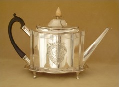
The second example is by Robert and David Hennell, and as in
the previous case this teapot is quite large with the body
measuring a little over 6 inches across. It seems the design
goal of the artists was to create a teapot that conveyed a
feeling of importance. Therefore they chose to use the teapot’s
substantial horizontal mass to achieve this. First, they
engraved a series of horizontal lines at the top of the teapot
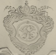
and then centered a large cartouche in the remaining field. The
serpentine-shaped front highlighted the cartouche, which they
further emphasized by framing it with protruding flat surfaces
on either side. The end result: someone hardly notices the
teapot’s body mass but rather is drawn immediately to the
central cartouche. (Actually it seems almost a shame that the
cartouche houses an engraved initial rather than an elaborate
crest or coat-of-arms.)
While the domed lid and ivory finial add a bit of vertical
dimension, they also seem to impart a regal feel to the piece
and almost give the impression of a crown.
There is also a sense of functional activity incorporated into
the design. The black ebony handle attached by means of long
handle brackets minimizes the apparent protrusion of the handle
on the left side, while the greater length and curved tip of the
spout emphasize that functionality resides on the right side.
Also, as with the previous example, the teapot sits prominently
on a conforming-shaped stand, which is supported by four
delicately scrolled feet.
Teapot and stand: Robert and David Hennell 1795 (left) and Cartouche engraved with "R"
initial (right)
|
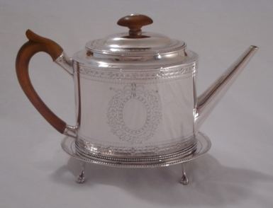
The last example was made in the shop of Hester Bateman in
1783 (Hester was in her early 70s and likely her sons, Peter and
Jonathan, were overseeing her shop on a day-to-day basis). It is
considerably smaller than the previous two examples (the body
measuring a bit less than 5 inches across), so the
width-to-height proportions of the teapot body were less of a
design concern. However, because the teapot had a simple oval
shape the engraving and overall proportion became key factors
for the success of the final design. In this case the artists
decided to add a stepped, slightly domed lid to add a bit of
height to the teapot body. They carried this theme through to
the finial, which mimics the domed lid, even down to the silver
button on top.
In order to add a bit of elegance and tie the elements together,
the artists engraved bands at the top and bottom of the body to
frame a center field, in which they engraved an elaborate
cartouche. This cartouche has a floral motif, which was a
primary design motif favored by the Hester Bateman shop
throughout most of the 1780s. To further add interest as well as
integrate the various components, they added beaded edges
surrounding the teapot lid and base and also the edge of the
stand (this machine-formed beading was something the Bateman
shop produced - and likely sold - and is found on a large number
of their teapots)
The simple handle and spout are perfectly balanced, and
compliment the design primarily by not distracting from the
proportions and engraving of the main body. The four
ball-and-claw feet) on the stand add a bit of additional
elegance to the presentation (another design preference of the
Bateman shop).
The three examples discussed date from 1783 to1798. Even
though the teapots presented different design challenges, we
feel in each case, the artists were able to successfully create a
statement that has lasting appeal.Of course, personal taste
plays a major role with art, since truly "beauty is in the eye
of the beholder". Therefore our judgment as to the appeal of any
given form might well be different from someone else’s, but then
that’s what makes life interesting.
Joanne and Emmett Eldred
- 2011 -
|
|
|


