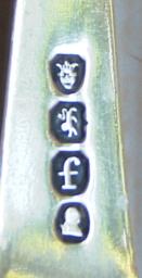
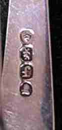
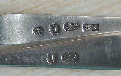
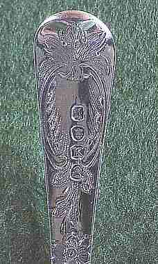
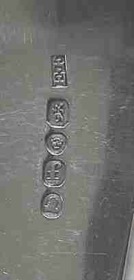
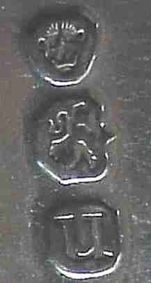
(click on photos to enlarge image)
LONDON HALLMARKING ON 19th CENTURY FLATWARE
The methods of marking from 1781 onwards require a good deal
of close examination to determine what nuances of difference
were introduced in the engraving of punches to outwit
unscrupulous silversmiths.
As I have stated elsewhere it becomes obvious that marks on
teaspoons could be easily "let in" on the foot rims of jugs and
other similar items so that it was of some importance that
teaspoon marks could be differentiated from other marks of
similar size.
Apart from the omission of the leopard's head the main
difference between the teaspoon mark and that used on other
plate is in the shape of the punch in which the sterling lion is
engraved. Whereas on all marks, other than those designed for
tea and other small spoons, the lion is in a rectangular box
with an ogee base and canted top corners the lion on these
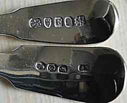
smaller spoons between 1781 and 1785 is in a roughly oval
outline. (Fig 1)
For plate other than teaspoons more than one punch, and indeed
stub for use in a fly press, of the same size was made for each
year and these punches and stubs were designed for use on
specific items and were, usually, not interchangeable although,
oddly, this rule does not hold good for sugar sifter spoons.
The punches used on sugar sifters varied and there is no obvious
reason for this variation.
Fig. 2 shows two fiddle pattern sifters of the early 19th
century. The one bearing the date letter "F" for 1801 is five
and nine tenths inches long and the one bearing the date letter
"C" for 1818 is five and seven tenths inches long. They are both
therefore virtually the same size and were both marked by means
of the fly press but on one the teaspoon stub has been used
whilst the other has been marked using the large spoon stub!

|
Fig. 1: Teaspoon hallmarks for 1784/5 showing
the oval outline to the lion.
(note the duty mark on the upper spoon which shows
that this spoon was
assayed after 1st December 1784 whereas the lower
spoon was assayed
between 29th May and 30th November
1784.)
|

|
Fig. 2: Top marking on sugar sifter spoons
showing different
fly press stubs used to mark spoons of similar size
|
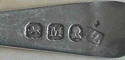
From 1786 until 1805 the outline to the lion becomes
rectangular with a curved base and canted top corners (Fig. 3)
although in the years 1792, 1793, 1794 the punch outlines are
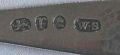
not well defined. From 1806 onwards the outline adopted is the
same as for other punches; i.e. rectangular with an ogee base
and canted top corners. (Fig. 4)

|
Fig. 3: Teaspoon hallmark showing the outline to
the lion in use between
1786 and 1805 (NB: This outline can appear almost
oval especially in 1792)
|
The outline of the date letter during this period
consistently has a curved base and canted top corners, (Fig. 3)
but variations in the overall shape between square and
rectangular give rise to an almost egg shaped outline in some
years, notably 1792 ( Fig. 5).
From 1805 until 1809 it, like the sterling lion, adopts the
standard canted top corners and ogee base appearance (Fig. 4).
There is no obvious explanation for the poor execution of the
engraving of the outlines to both the lion and the date letter
in the years 1792, 1793 and 1794. In neither are the canted
corners well defined but neither has been engraved in an obvious
ovoid form which would suggest an intentional deviation from the
mark outlines of the other years in this sequence. It could be
just a matter of pressure of work on the engraver and it has to
be said that the margin between canted corners and a curved
appearance is somewhat narrow especially when the mark has
become worn. Experimentation was continuing and in 1792 the
workload falling on the engraver, John Pingo, from the Company
had become so great that he had to give up his own business in
order to cope with it and this gave rise to a petition in which
he enumerates this growing workload. The following is an extract
from that petition sent to the Court of Assistants of the
Goldsmiths' Company by John Pingo in 1792 which throws some
light on this:
" ....59 Marks only were delivered in 1790 - 240 Marks
delivered in 1791 - 262 Marks delivered this day besides 39
delivered since January last, making in all 301 Marks delivered
in 1792"(see
note 1))
Was he perhaps cutting corners both physically and
metaphorically?

|
Fig. 4: Teaspoon hallmark showing the outline to
the lion in use from
1806/7 onwards and the outline of the date letter
from 1805 until 1809.
|

|
Fig 5: Teaspoon hallmark showing the date letter
outline apparent in 1792
(note that the lion outline can appear virtually
oval in this year)
|
There are obvious variations in the shape of the outline to
the duty mark in specific years but these are concerned with the
Government's increase in the amount of duty payable and for
information on this I must refer my reader to the excellent work
on the subject published by A.B.L. Dove F.S.A. in "Antique
Collecting" ( September 1984 ) and reprinted in 'Silver Studies',
the journal of The Silver Society, number 22 (2007).
The only other observations to note concerning the duty mark are
that from 1784 to 1832 the mark was engraved as the monarch's
bust and from that date onwards until duty on plate was
abolished in 1890 the mark was engraved as the monarch's head
couped at the neck. The incuse mark of George III and the mark
of Queen Victoria face to dexter and all other duty marks face
to sinister.
There is, however, one important feature to note in connection
with the duty mark and this concerns that used during the reign
of Geo IV (1820-1830). It appears that John Smith, who was by
then the Company's engraver, attempted to represent the 'quaffed'
hairstyle of Geo IV but in some years, notably 1830, has
executed the engraving so poorly that, if the bust of the
monarch is recognisable at all, it almost appears to be crowned.
(Fig. 6). It is not known exactly when Smith's eyesight began to
deteriorate but it had got so bad by 1839 that he was forced to
retire and the position of engraver to The Goldsmiths' Company
was taken by William Wyon. It may well be that poor eyesight is
the explanation for this misleading engraving and the unwary may
be tempted to think that it is a forgery. It is, however, just
one more small peculiarity to be aware of.
That in any given year the marks have been impressed in such a
way that they must sometimes be read with the bowl of a spoon on
the left and sometimes with the bowl on the right is, I believe,
of no significance since, from the point of view of
transposition, once the marks have been cut out of the spoon it
makes no difference which way round they were stamped. The order
in which they relate to each other, however, may be of
significance. The date letter on small spoons precedes the lion
between 1781 and 1785 and follows it from then on. The duty mark
is always the last in the sequence on tea spoons whereas on
sugar tongs it is the first in the sequence (Fig. 7). On larger
spoons the date letter is first in line followed by the lion
with the leopard's head next. The duty mark is always last so
that during the incuse period when it was applied before the
hall marks the latter often had to be squeezed in between it and
the maker's mark. From 1786 when the duty mark was incorporated
with the other marks on the fly press stub the sequence on large
spoons became the same as on other plate, namely; lion. leopard,
date, duty (Fig. 8).
Notwithstanding all this endeavour on the part of The Goldsmiths'
Company and that by the statute 13 Geo. III cap.59 the penalty
for transposing marks, as with other types of fraud, was
fourteen years transportation, the practice appears to have
continued and it is not surprising, therefore, that in 1805 the
committee resorted to marking large flatware in the way in which
it had been marked before 1781 with the lion at a right angle to
the other marks. The layout of the marks also adopted a vertical
format (Fig. 9).

|
Fig. 6: Hallmark for 1830/1 showing the
engraving of
the King's bust duty mark with crown like hairstyle.
|

|
Fig. 7: Press mark on tea tongs showing the duty
mark first in the sequence
|

|
Fig. 8: Tablespoon by George Wintle London
1801/2 showing the order of marks from 1786/7
|
It must have been considered that the omission of the
leopard's head on teaspoons and sugar tongs would suffice to
protect against their use for transposition but alas this was a
forlorn hope. Helmet cream jugs mounted on square plinths can be
found marked along the foot rim. Such marks are not only in the
wrong place but will be seen to be missing the Leopard's head
mark indicating that that part of the foot rim started life as
the stem of a teaspoon and that the jug was never assayed.
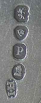
In 1810 the layout of the marks on teaspoons and sugar tongs
became the same as for larger flatware, i.e. a vertical stub was
used but with the marks in the order lion, date, duty and
although the lion outline retained its ogee base that of the
date letter reverted to the curved base appearance. It was not
until 1821 that the decision was taken to add the leopard's head
to this sequence which then became leopard, lion, date, duty.
There are two other features affecting hallmarks which took
place during the first half of the 19th. century and it is
difficult to see how either could have been connected with
security although just what they were connected with I have been
unable to determine.
Firstly, in 1821 the Company's engraver, John Smith, was
instructed to make "experimental" stubs as well as the regular
ones. The alterations chosen were to make the sterling lion
passant instead of passant guardant and to deprive the leopard,
which appeared for the first time on tongs and teaspoons in that
year, of its crown.
This arrangement applied only to the vertical marks used on
flatware. When the new marking year started the new regular
stubs were used but the committee soon approved the experimental
press marks and they therefore came into permanent use. Thus
1821 is known to collectors as the year in which the leopard
lost its crown but because the introduction of the new stubs
took effect after the marking year had started there are pieces
stamped in that year with either the crowned or the uncrowned
leopard. (Fig 10)
In 1822 all stubs and punches were engraved in this new way and
this format has remained in use for marking all plate since then.
There is one other peculiarity which was introduced on the
experimental stubs and that is that the outline to the lion
became a rectangle with canted top corners and a curved base on
large flatware, Fig. 11, but the ogee base to the lion outline
remained in force on small spoons and tongs until the end of the
1821/2 marking year. The new, curved base, outline came into use
on these items in the marking tear 1822/3 and remained in use on
these until1826. The lion outline reverted to the canted top
corners and ogee base format on large flatware in 1823 and 1824
but returned again to the curved base in 1825. From 1826 onwards
it had the ogee base which became the standard pattern for all
stubs and punches.
The other, somewhat baffling, feature is what has been described
as "the punk leopard". Between 1834 and 1839 the leopard has 'hair'
which appears to stand on end in what can only be described as a
'punk' style (Fig 12). It has been suggested that this feature
was an accident accounted for by Smith's failing eyesight but
the hairs are much too carefully and neatly engraved to be an
accident and besides they are reproduced in exactly the same way
in each of the years mentioned.

|
Fig. 9: Large spoon of 1805 showing vertical
marking
|


|
Fig. 10: Hallmarks on sugar tongs showing both
the crowned and
the uncrowned leopard's head used in the 1821/2
marking year.
|

|
Fig. 11: Tablespoon possibly by Edward Farrell
London 1821/2 showing the marks used on large
flatware (uncrowned leopard, the lion passant and
the changed shape of the outline to the lion).
Note the curved base appears to have been created by
canting the bottom corners.
|
Furthermore it seems that Smith was experimenting with this
form of the leopard from the moment it lost its crown in 1822,
long before his eyesight is known to have been failing. During
the later 1820s he engraved the leopard on the punches used on
large plate in two forms. In one the leopard is bald and clean
shaven and in the other it has whiskers and the suggestion of
hair. It is likely that pieces will be found marked in either
way but both are genuine. This peculiarity does not appear on
the vertical stubs used on flatware. I thought at first that
this was a satire by Smith on William IV who was known to have a
'bouffed' hairstyle and, in fact, was known as Pineapple Head.
However he came to the throne in 1831 and was gone by 1837 when
Queen Victoria acceded to the throne so that theory hardly holds
water. I have puzzled over this for some years and have found
nothing in the minute books at Goldsmiths' Hall to throw light
on this oddity. I have to admit that I cannot come up with a
satisfactory explanation.
Although the early representations of the leopard are quite
obviously of a male lion, during the latter part of the 18th
century the leopard takes on an almost human appearance and in
the early 19th its crown has the three points of a jester's hat
making it look like a jester (Fig. 10). After 1821 the leopard's
visage takes on a troll-like expression and the most likely
explanation for these variations is that the engravers had never
seen a leopard! The more modern representation is quite catlike
and easily recognisable.

|
Fig. 12: Hallmarks for 1835/6 showing the
'Punk' hairstyle of the leopard's head
|
ACKNOWLEDGEMENT
I am indebted to the Worshipful Company Of Goldsmiths for
allowing me the privilege of examining their records.
David McKinley
- 2014 -
David McKinley devotes much of his time to
researching the history of silversmithing in England
with particular reference to hallmarking at the London
office. He writes for both The Silver Spoon Club of
Great Britain and The Silver Society.
David McKinley is the author of the book THE FIRST
HUGUENOT SILVERSMITHS OF LONDON
Information about the content of this book and the
discounted price applied to members of ASCAS is
available in
September 2011 Newsletter
|
|

